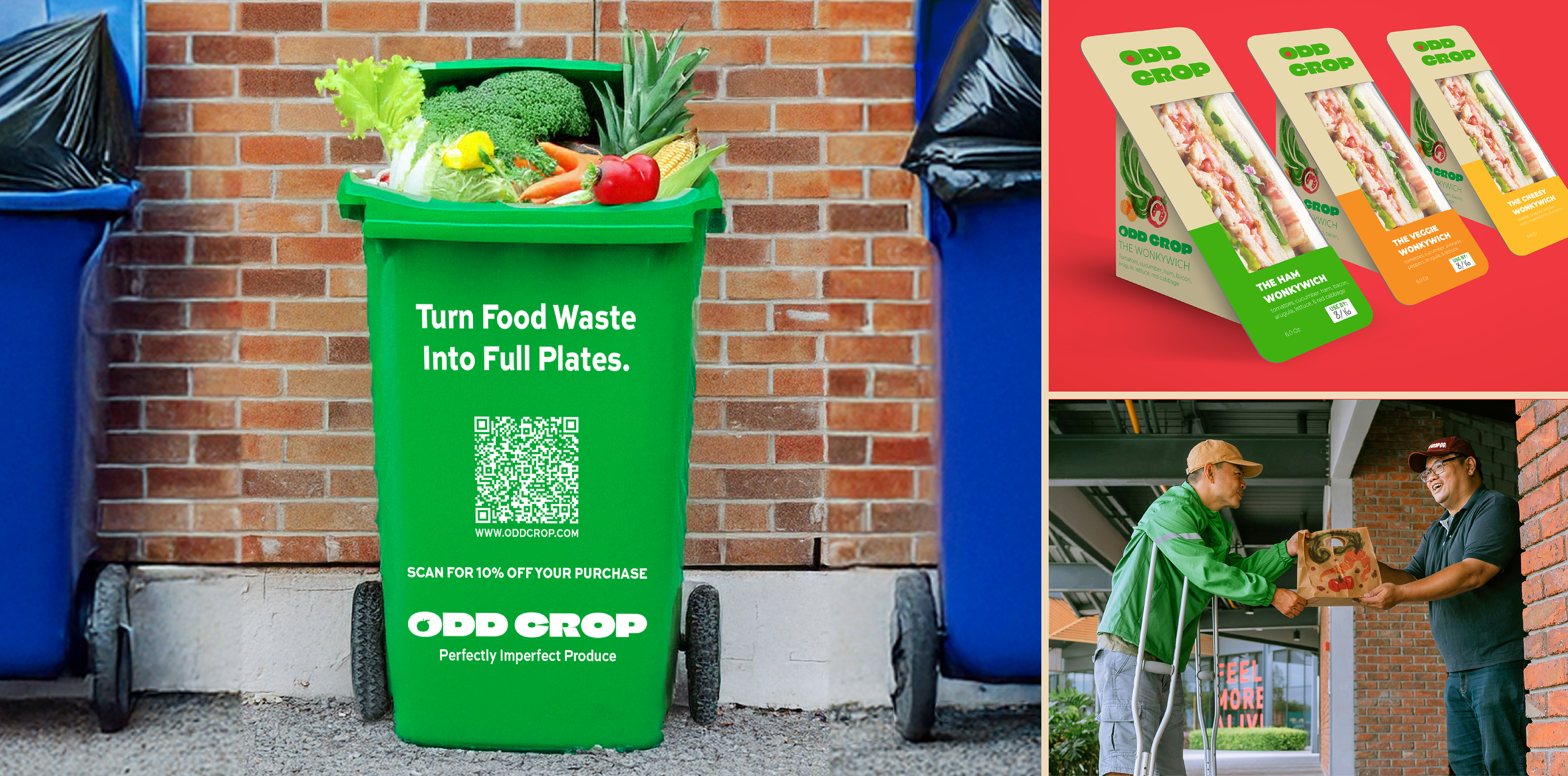
Taking a theoretical approach, this proposed enterprise consists of a brick-and-mortar store that would sell imperfect produce that normally is discarded despite being perfectly edible.
By locating these stores in cities where food deserts are an issue, this business would help by providing cheaper produce to those in need along with decreasing the problem of excessive food waste. Making this company have a physical location is crucial due to online companies and competitors in the imperfect produce market pricing out many people who would otherwise buy this product if it wasn’t for drastically rising shipping costs.
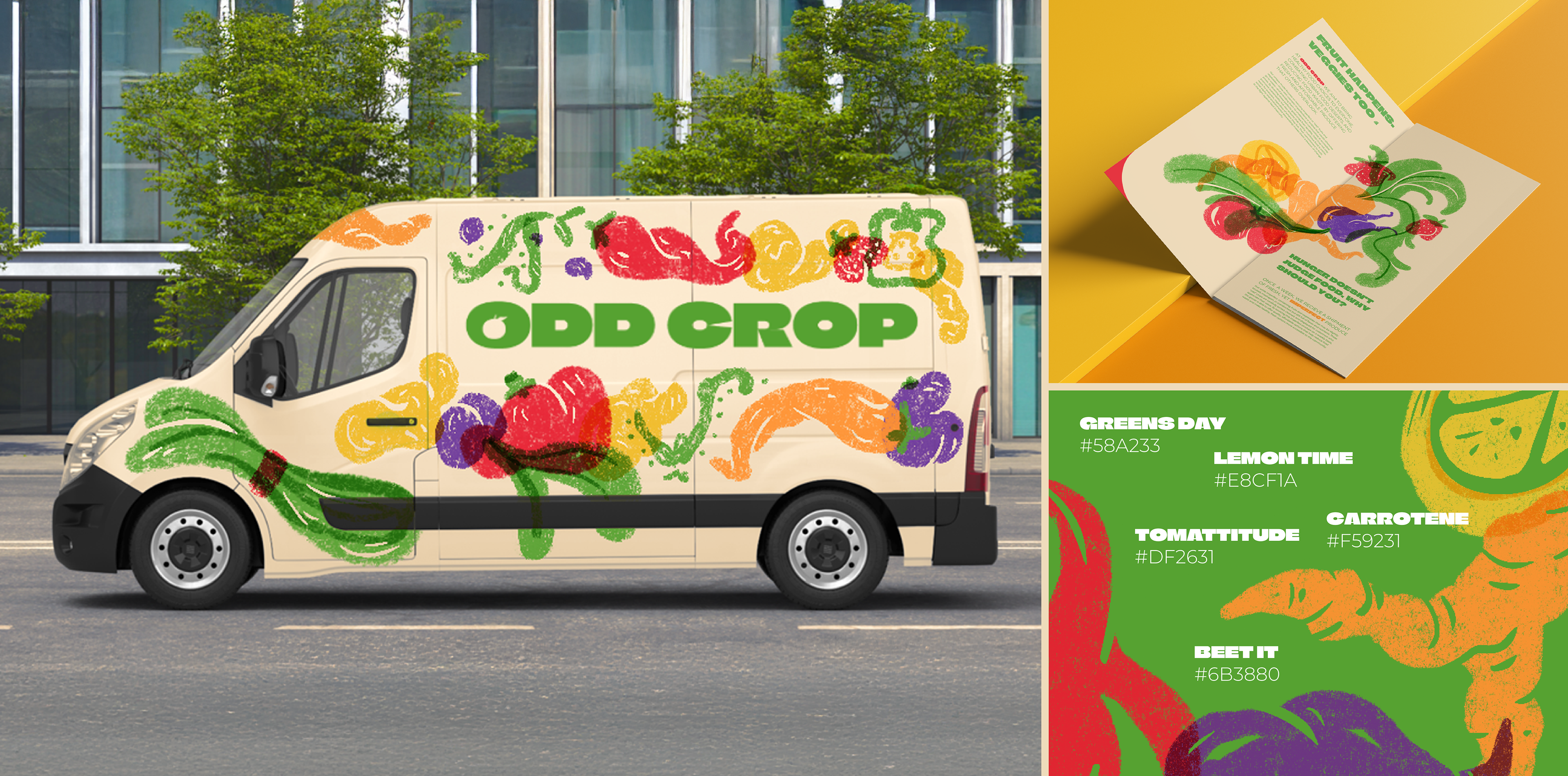
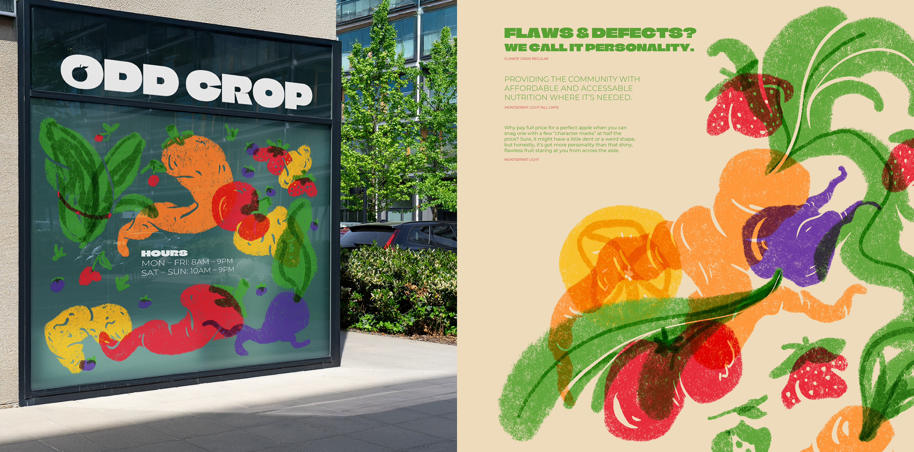
One of the goals of this company was to change people’s perception of visually imperfect produce by taking a lighter, engaging, and fun spin on how that produce isn’t perfect, but still good. By using an organic and down to earth illustration style inspired by risographs and texture, Odd Crop’s branding serves to make these imperfections of their product a defining positively viewed feature rather than a negative one. The ability for the company to be seen as bright and inviting is important too since one of its goals is to bridge community gaps and provide for those who live locally by addressing nutritional issues caused by food deserts.
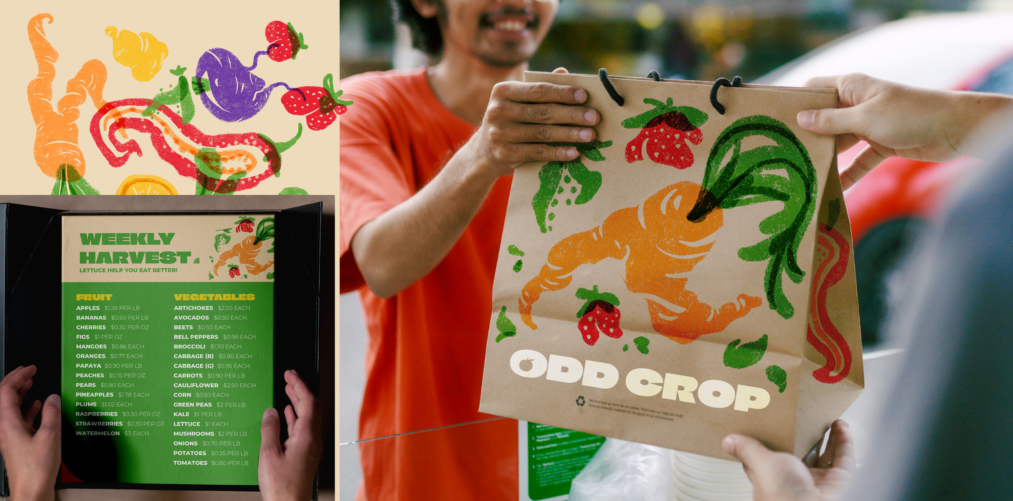
One of the main things that I gained experience from in this project was how illustrative branding was utilized. By combining more simple and legible typography with the more complex illustrations, this brand resulted in a balanced cohesive look that stands out against possible competitors.